Parship purchased eharmony in November 2018 and planned to migrate eharmony onto their platform with very few updates to the existing platform, beyond restyling the site to reflect eharmony’s branding.
My involvement with the project began with an email requesting my feedback on Parship’s proposed prototype. I completed an initial heuristic and competitive analysis and responded with questions, suggested updates, and recommended UX and UI improvements. This emphasized the need for usability testing in the United States, which I designed and moderated. The final reports I submitted included a full write-up of the usability test results and my recommendations for UX and UI improvements. Parship is still in the process of developing and shipping these updates.

My Role
Senior Product Designer and UX Researcher
Tools
Sketch, Word, Excel, Adobe Illustrator and Acrobat, QuickTime
Challenges
Parship is an online dating site based in Germany and primarily in use there and in neighboring European countries. Their dating website was not tested on audiences in the United States, the interface did not appear to have been updated recently, and was not being translated into plain, conversational English. Parship planned to launch the “new” eharmony with minimal copy improvements and no UX/UI updates by November 2019.
In April 2019 the designers at Parship emailed a prototype which had not been tested and had many UX and UI issues. The issues included, but were not limited to, off-brand colors, unintuitive icons and user flows, superfluous features, which added to the visual clutter and page length, excessive copy, long descriptions and CTA labels, and more.
Solution
To conduct US-based participant usability testing and then recommend UX and UI improvements based on the initial prototype analyses and final results of the usability testing.
Project Goals
• Convey the importance of improving the overall user experience, how it can retain customers and also gain new users
• Modernize the overall UX/UI of the site
• Simplify and reduce the amount of text in order to improve understandability
• Increase consistency and usability of work flows and designs
How I did the Research
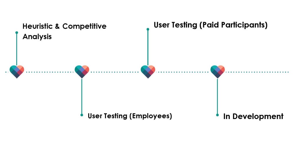
Usability Testing
Employee testing
Parship showed interest in my initial heuristic and competitive analyses and requested I proceed with user testing on their existing prototype. As the site’s copy still hadn’t been translated into easily understandable English, I suggested that we break up the testing into two stages.
Stage one would focus on the most important workflow and visual design issues and would only involve testing employees. Parship agreed and I proceeded to select five employees who were not on the tech team, were familiar with competing online dating sites, and who were all frequent mobile device users.
Paid Participant testing
Stage 2 was conducted with paid participants on the dev site, per Parship’s request as user acceptance testing had begun on the dev site. This posed some difficulties with the paid-participant round of testing as the dev site did not include many of the updates that had been included in the last iterations. Due to the limited amount of time available for this round of testing, I was not able to fully test new issues discovered in the dev site. I then submitted my final reports with additional recommendations for UX and UI improvements and copy updates, including new issues where I could.
My reports included:
- Testing Specifications
- Employee backgrounds
- Results of usability testing
- Results of a subjective, post-testing survey
- Recommended UX/UI improvements
Usability test results included task completion rate evaluation with time on task, the error-free rate percentage, the details of errors, whether they were critical or non-critical, and included participant commentary for reference. UX/UI recommendations included mockups of visual and interface designs showing changes to user flows, iconography and copy.
What I Learned and Designed
After reviewing the initial prototype and completing the usability testing, I submitted several reports which included my UX/UI recommended improvements. Below are three examples of those design recommendations.
Example #1 – All Matches and Edit Match Preferences Task Flow
Parship’s Original Prototype Screens
“All Matches” Issues and Improvements
UX/UI improvements
- Upsell banners
- The upsell timer was relocated from just below the header to below the fold, between match thumbnails. The relocation was prompted by usability issues when the upsell became an obstacle to accessing the main navigation for a couple of the testers, it also added unnecessary clutter to the already busy page
- Based on a competitive analysis and testers’ frustration, I minimized the number of upsell buttons on the Edit Match Preferences page, which were located above each “paid” filter. I relocated all “paid” filters to below a single upsell button so users could more easily:
a) see that the filters after the upsell banner required an additional cost
b) scan the filters available without scrolling over several identical upsell buttons
c) find the one filter not requiring an upsell that was located below several paid filters
- Edit ‘Match Preferences’ workflow:
- Editing match preferences took participants nearly 43 seconds on average to complete the task
- Search Icon: Testers expected that the search icon would open a search field to enter specific profile names or keywords, so the majority of testers didn’t think to click on it to edit their match preferences. When a participant clicked on the search icon, the existing workflow took the user to below the list of ‘All Matches’ on the same page, which led to more confusion. In order to edit matches, the user then had to click on the ‘Edit Preferences’ button which finally took them to the Edit Match Preferences page.
- In the mock-up below you can see my recommended improvements, which included changing the ‘edit match preferences’ filter icon, and on clicking it, the user would be taken directly to the Match Preferences page where the user could edit their preferences. The All Matches page would then be solely devoted to the list of matches
Recommended Improvement Mockup
Visual improvements
- Updated all colors to be consistent with eharmony’s branding
- Increased contrast between active and inactive states of both the main navigation icons and the tab labels
- Recolored the upsell timer and match filter upsell so that it matched eharmony’s colors
- On the Match Preferences page, the individual filters were redesigned to be consistent with one another
- Icon updates
- Favorite star: The 5 points in the new design are now symmetrical; The gradient square with an asymmetrical star cut-out is now a solid/outlined shape with a solid color fill
- NEW tag: added padding to be consistent with other icons on the Match thumbnails, reduced size and removed gradient which was inconsistent with brand colors
- Filter icon: Replaced magnifying glass icon with the funnel icon to represent the matches filter
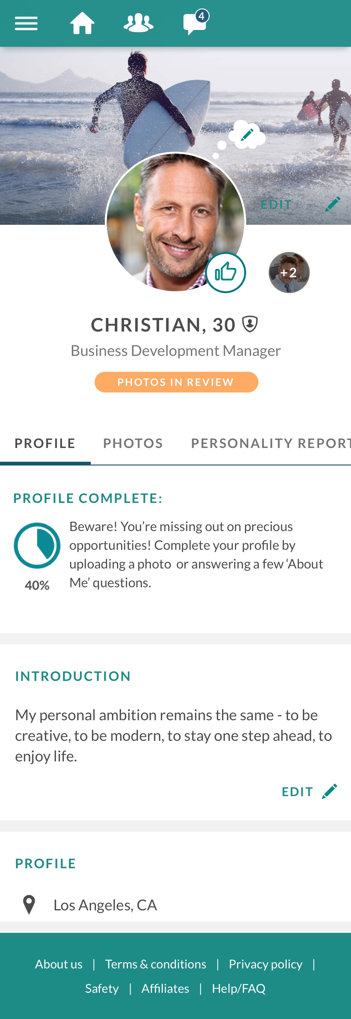
Example #2 – My Profile
Parship’s Original Prototype
This screen shows the original prototype’s Profile page, featuring the “Profile Complete” alert section at the top. Many edits were ultimately recommended, but I’m going to highlight this particular feature as it caused the most critical errors during testing.
The “Profile Complete” alert contained extremely critical information for the user as it was supposed to explain that some features wouldn’t be permitted until the user’s profile was at least 50% complete. It also recommended which sections should be updated in order to complete their profile.
Issues
- Testers did not notice, and/or did not read the alert, ignoring or scrolling over it when asked to find and read it
- When testers were shown the alert, they were not able to understand what it was saying and did not include all the information needed to successfully complete their profile
- 4 out of 5 of the employees tested, and 3 out of the 6 paid participants, experienced critical errors when asked to complete their profile according to the alert
- On average it took testers almost 30 seconds to complete the ‘About Me’ questions according to the alert, as they had to scroll up and down their profile to search for the section
‘Profile Page’ Recommended Improvements
To the right is the mock-up of the Profile page with my recommended improvements to this message, which included:
- Added a background color to highlight the message
- Emboldened the font so it was more noticeable
- Added links to the recommended sections on the user’s profile so they could easily tap the text and be taken to the section to edit, thereby removing the obstacle of searching around the page to find the sections mentioned
- (Note: The bold copy was not final as there were other features that were limited but I did not have a list of them at that time.)

Example #3 – Match Profile
Parship’s Original Prototype
For your reference, the animation below shows how a Match’s Profile page appeared in Parship’s original prototype. As you can see in the original prototype, there was a lot of text and very long sections, requiring the user to scroll and scroll.
Usability test participants commented on several issues related to the design of the match profile. These issues underscored several of the issues found in the initial heuristic analysis. Below includes those issues and others found in the initial analysis of the prototype:
- Page length
- Long sections of text
- Length, spacing, and styling of demographic information
- Confusing/unintuitive icons
- “Compatibility Score” graphic section, which appeared like an advertisement in the middle of the page, and impeded the user flow and wasn’t needed as there were two other ways to access the details of the Compatibility Score above the fold
- Redundant features and/or icons
- Visual styling that was hard to read
Recommended Improvements
- Added the Favorite Star was, which was only available on the All Matches page, making favoriting a match very difficult for users
- Changed some microcopy to be more intuitive
- Removed script font and gradient chips from the “Short Facts” section
- Simplified the demographics list by grouping similar features, as they are in competing apps, reducing space between sections, revising some icons, and truncating the section so that it would only take up a fraction of the screen
- Added “Read More” to truncate long sections, which reduced scrolling. Testing participants were not interested in reading that much to begin with and were used to being confronted with shorter profiles in competing apps
- Revised FAB icon from the ‘send’ icon from the message page, to the ‘message’ icon at the top of the page, so it was consistent
- Removed redundant signifiers which included ‘Like’ next to the ‘thumbs up’ icon; testers indicated that they knew what the icon represented
What was the outcome?
Overall my reports were received pretty well by Parship’s Director of Product! He followed up with the below emails, where he describes the next steps and his impression of the work.
It seems that I was able to convey the importance of improving the US customers’ experience through the results of the usability testing!
Email Regarding Employee Testing Reports:
I just wanted to send you just a short note on the progress of the UX testing that Maile did…working with an external ux company would have been so much more complicated. We should definitely keep this going and use this process to constantly check our progress in product development, market fit and ui improvements.
I have read the results documentation for the first round of employee tests and there is a ton of valuable insights in there. It is A LOT of content, wow. We are working through all of the input now to understand the results and act on the most important findings. I think my team is in good sync with Maile on this. We are working to bring the future live system up to speed for the next iteration of the tests with users/prospects…
So you can expect a lot of changes that we will implement directly into the product (most or all of the text changes for example). Some of the findings we will try to implement before cutover, if time and resources allow. And some of the findings will be part of our future effort after the cutover to improve the product experience mid- and longterm alongside with a lot of projects in that area.
Email Regarding Paid Participant Reports:
Thank you for sending this preview. It is really cool that you are doing the user research onsite in LA – the insights are very valuable and we could never have done something like this with US participants in Germany.
The very thorough and professional results preparation and analysis that you do for these tests is really appreciated!
Even if we will not be able to do a lot of changes now before cutover day, we will still use the results for all of the following steps in our further product development.
I would love to talk to you…about an ongoing process for product ux measures as part of the eharmony product projects coming up in 2020…
 maile malin