Sequoia, the internal content management system used at Internet Brands, was a complex application with many modules and customizable settings. The content for hundreds of IB’s company websites is mostly published through this CMS. Although it is the main application within which content managers, editors, and writers work daily, it was difficult for them to use, creating major issues and significant obstacles to their work. After years of employee complaints, the Sequoia team was finally given the green light to begin updating it. That’s where I came in.
My Role
End-to-end Product Design, leading research to final designs and working closely with PMs and Engineers to ensure a successful, feasible implementation.
Tools
Axure, Sketch, InVision, Zeplin, Adobe Illustrator
Problem
During user research I discovered that Sequoia was a major cause of frustration for all used it. Issues with the outdated and complex Sequoia came up frequently. It was in desperate need of a redesign as it was utilized across all verticals within Internet Brands by hundreds of employees and freelance writers.
Due to unnecessary modules and features cluttering the application and unintuitive and complex overall design, articles were left unpublished, employees struggled to get their work done so often that many teams chose to work in external content management systems, and many new employees were only trained in singular modules to avoid a lengthy and complicated Sequoia training processes.
All of this together resulted in a lot of wasted time and money for the company.
Solution
Create an intuitive, usable v3.0 interface in which employees could work more productively and efficiently through interviewing, observing, and listening to daily users of the CMS.
(This project spanned several, multi-faceted modules. I worked on it steadily between June 2017 and October 2018 before leaving the company for another position.)
Research Process
Goals
- Improve discoverability, usability, and intuitiveness of features for all employees, thereby optimizing employee efficiency and productivity, and reducing time-wasted and stress caused by the Sequoia 2.0
- Enable employees currently publishing content through third-party applications to easily transition into Sequoia, per business goals
- Reduce the time it takes to onboard and train new employees to use Sequoia
Process
- Heuristic evaluation of Sequoia v2.0, the Legacy website
- Heuristic evaluation of recently revised v3.0 modules
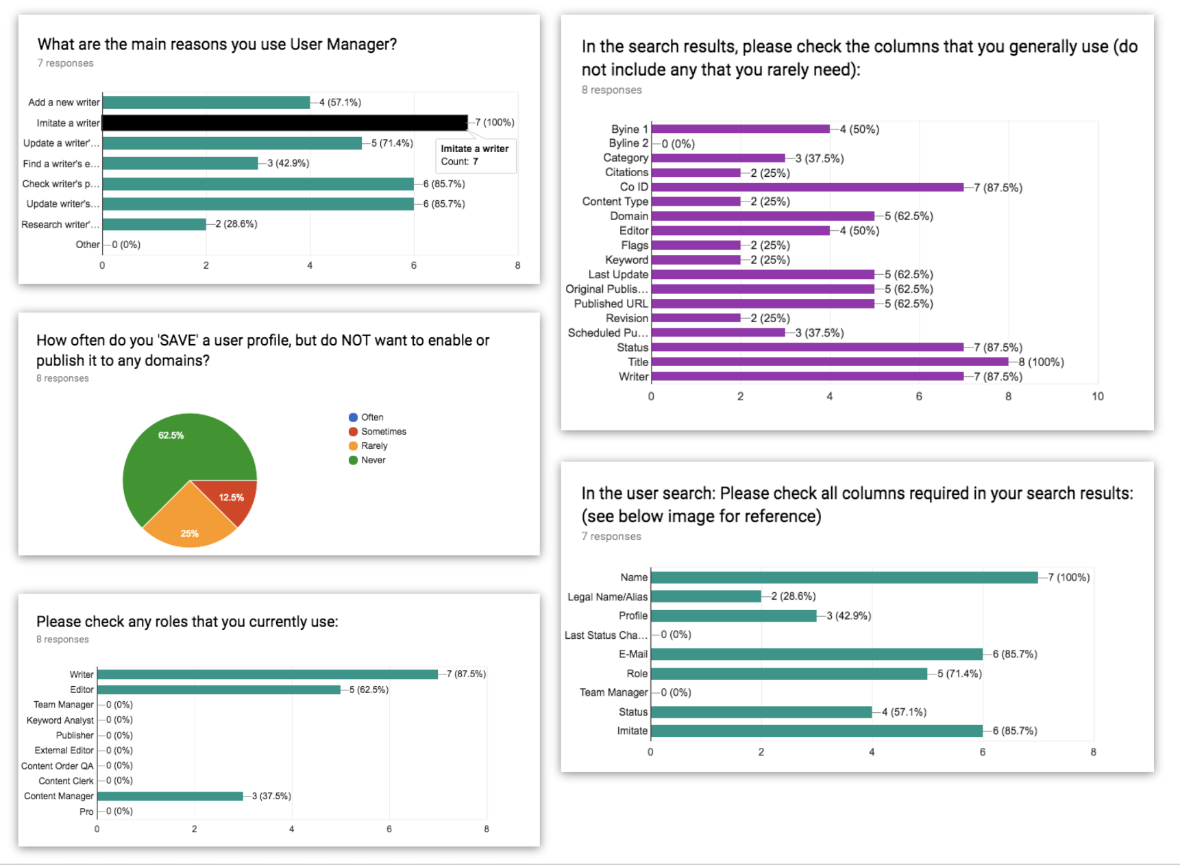
- User Research and Testing:
- Employee one-on-one interviews
- Contextual inquiries
- Observation
- Survey
- Usability Testing
Who/What I Studied
I began by familiarizing myself with Sequoia v2’s interface. I found from the very sign-in that the website appeared to require a guide and explicit instructions on how to use it. After interviewing several of the site’s users, including content managers and editors who maintained some of the biggest domains IB owned, I found that this issue was one of their biggest pain-points.
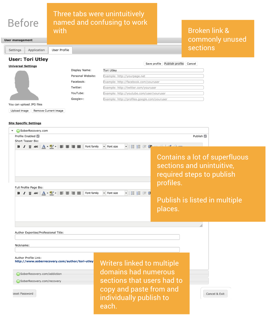
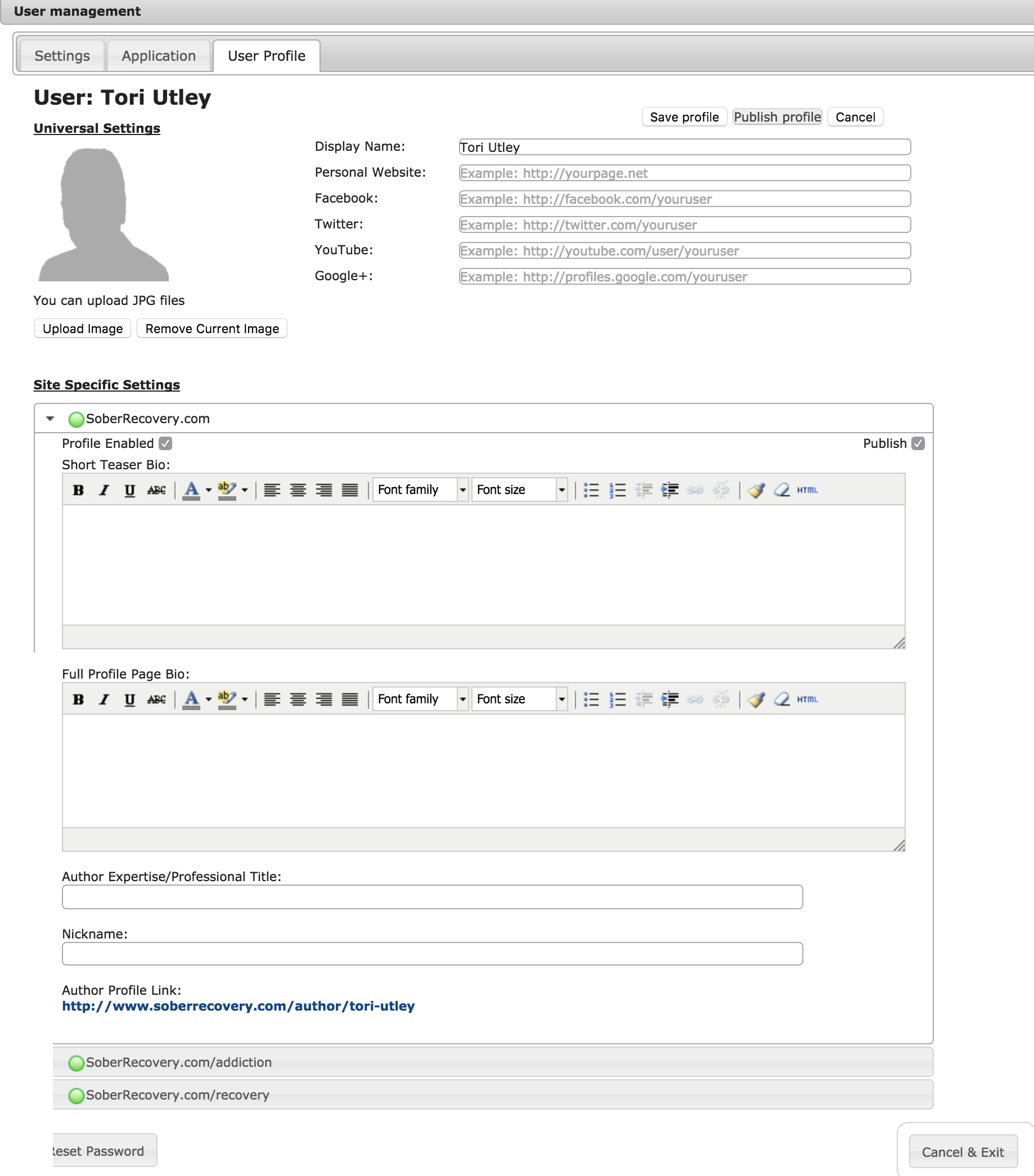
Sequoia was overwhelmingly difficult to use, had such a poor learning curve, and required so much cognitive load that content managers and editors dreaded training new employees to use it. The CMS contained a lot of outdated, unused, and/or unfamiliar functions. With so many functional issues, like a lack of clear signifiers, inconsistent verbiage, no instructional text, rarely any inline validation, and absolutely no tooltips or hints throughout the entire site, employees let me know how very frustrated and annoyed they had been with Sequoia. Several interviewees complained of years of frustrations and stress and never having their complaints addressed beyond receiving several-page, complicated PDF workarounds.

What I Learned
“We tend to give [new] people only as much information as they really need, just because there’s a lot in Sequoia that we don’t use.”
“There are a lot of rules in place that cause more issues to users than are helpful.”
“There’s a lot there that’s unnecessary…”
“I honestly don’t get it. i just know i have to do both” [Clicking two separate checkboxes to commit one task].”
What I Designed
• Wireframes Sketched on paper and mocked-up in Sketch
• Low Fidelity Mock-ups Created in Sketch and prototyped in Invision
• High Fidelity Designs Finalized in Sketch and exported to Zeplin to hand off to devs with explicit comments and Invision prototypes for reference
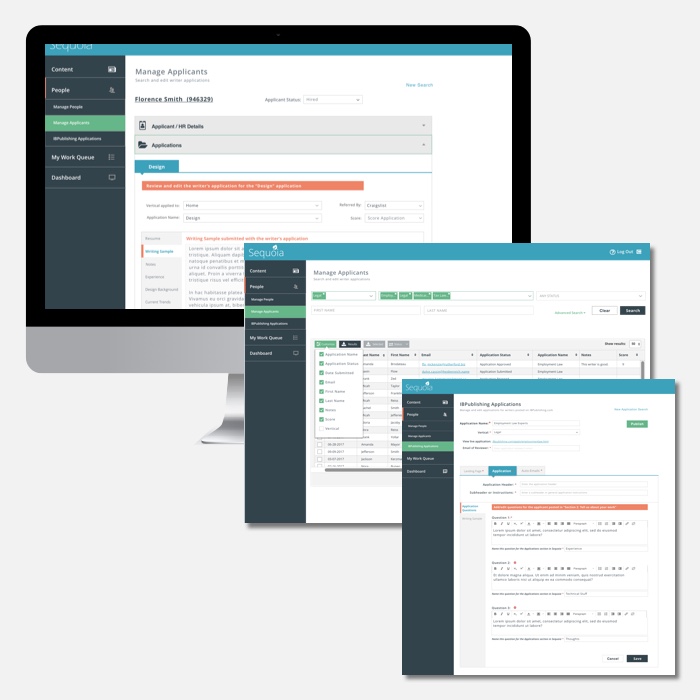
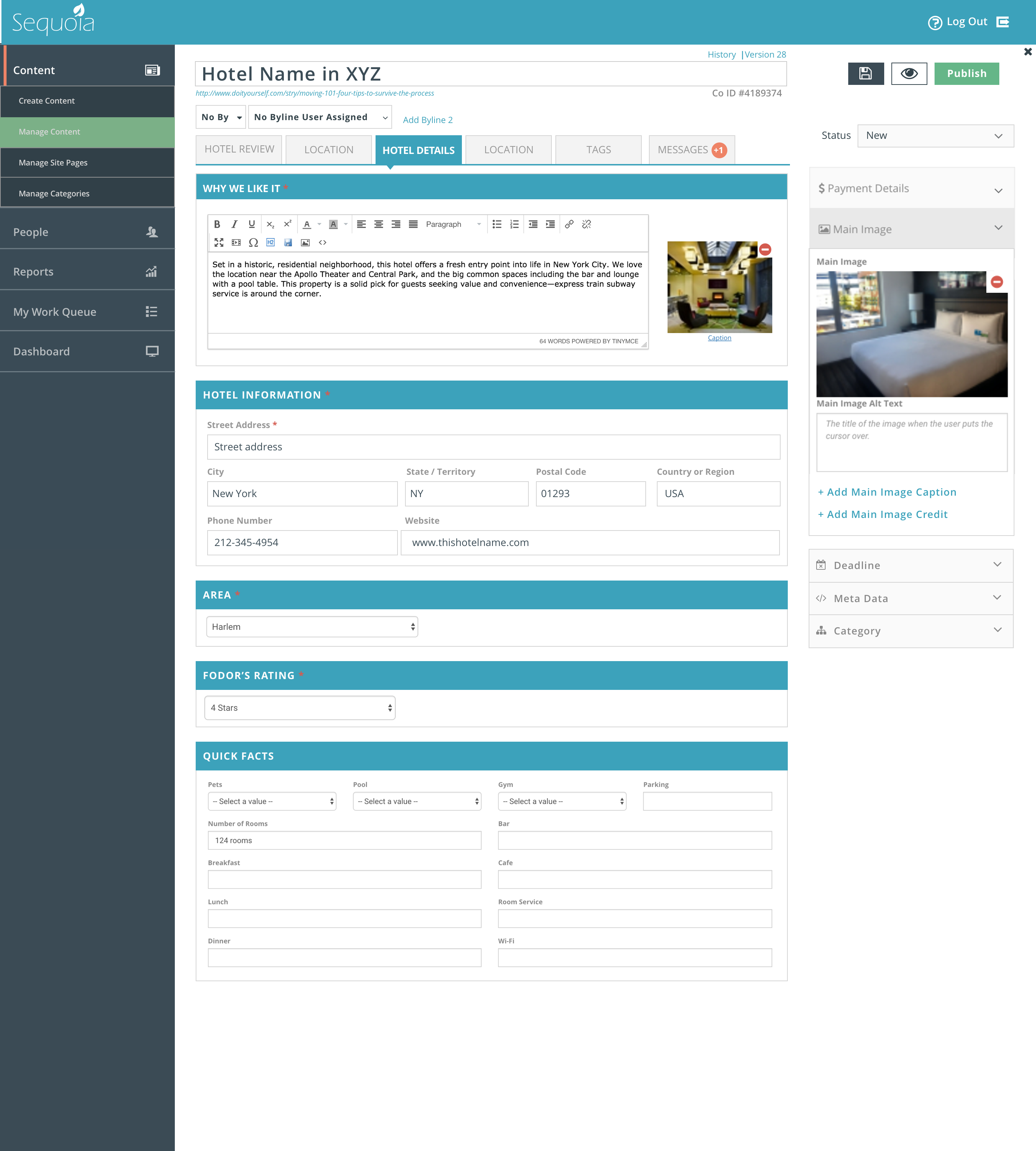
The bootstrap template that had been chosen for the v3 redesign was more visually appealing from the initial user testing. However, I discovered that the modules were still difficult to navigate, and there were a lot of hidden functions and features.
The previous version had been so cluttered that the redesign up to now had been focused on ‘cleaning’ up the interface as much as possible. This led to hiding mismatched features under a single icon, none of which included any hover tooltips or signifiers of any kind. Users were often given a generic error message without informing them of what action to take to fix the issue.
Another problem was the lack of hierarchy or organization in the designs- forms ran on without identifiable structure and pages were lacking any thoughtful information architecture. In short, v3 appeared to be v2, the legacy version, thrown into a nicer bootstrap template with all its issues and pain-points still intact, but with the addition of hidden features for the sake of ‘cleaning up’ the UI.


What was the Outcome?
To date, the new designs are still rolling out. Overall feedback has been extremely positive and employees have been very pleased with the new designs. As there have been a lot of old bugs in the backend that have impeded some of the progress, the transition from v2 to v3.1 has almost been completed as of October 2018.
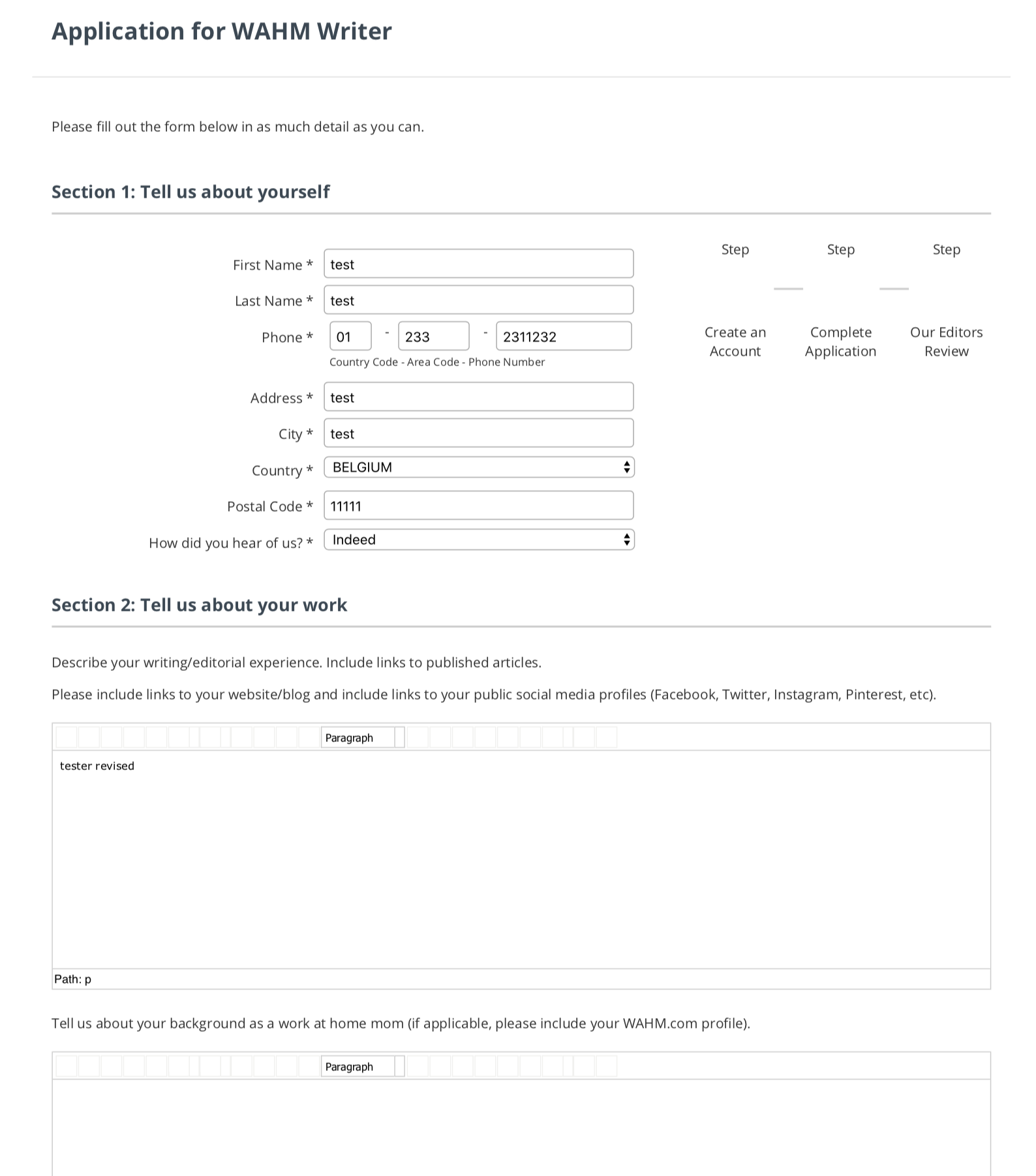
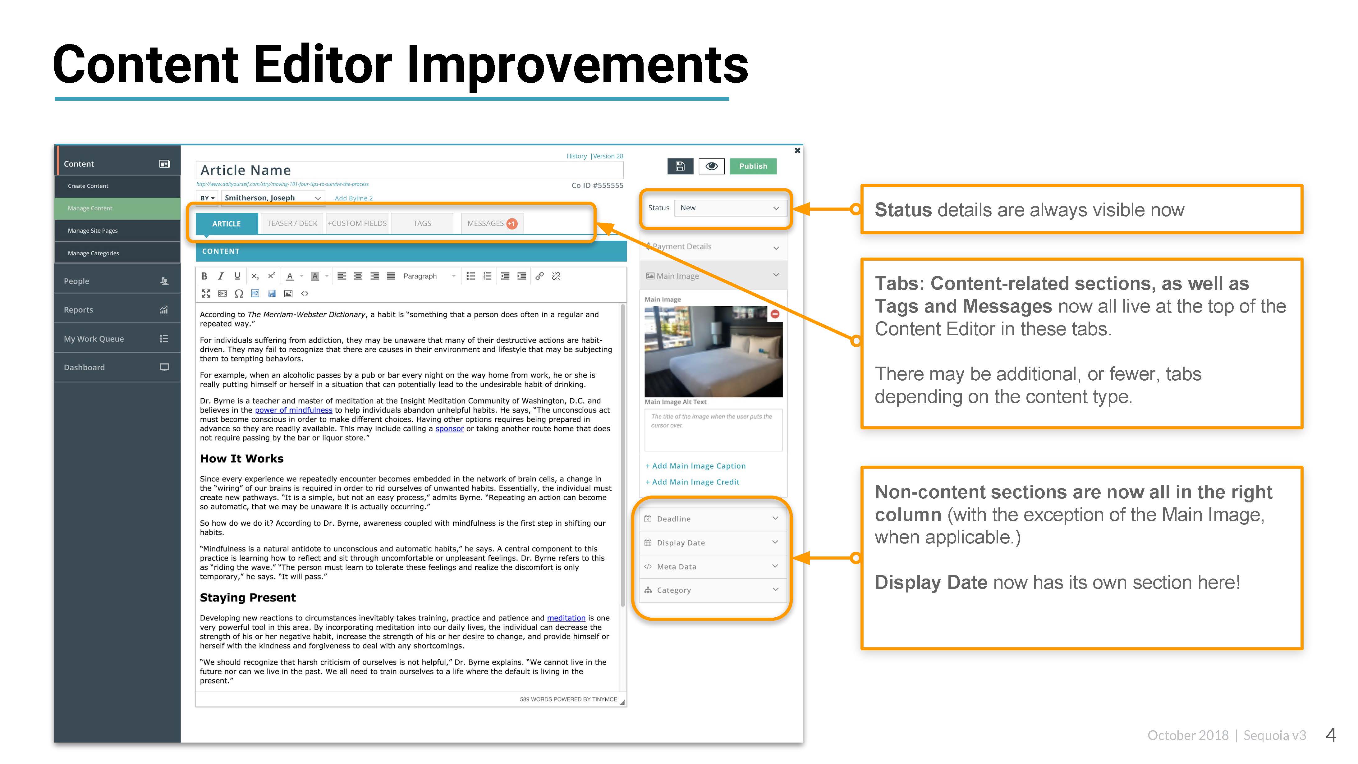
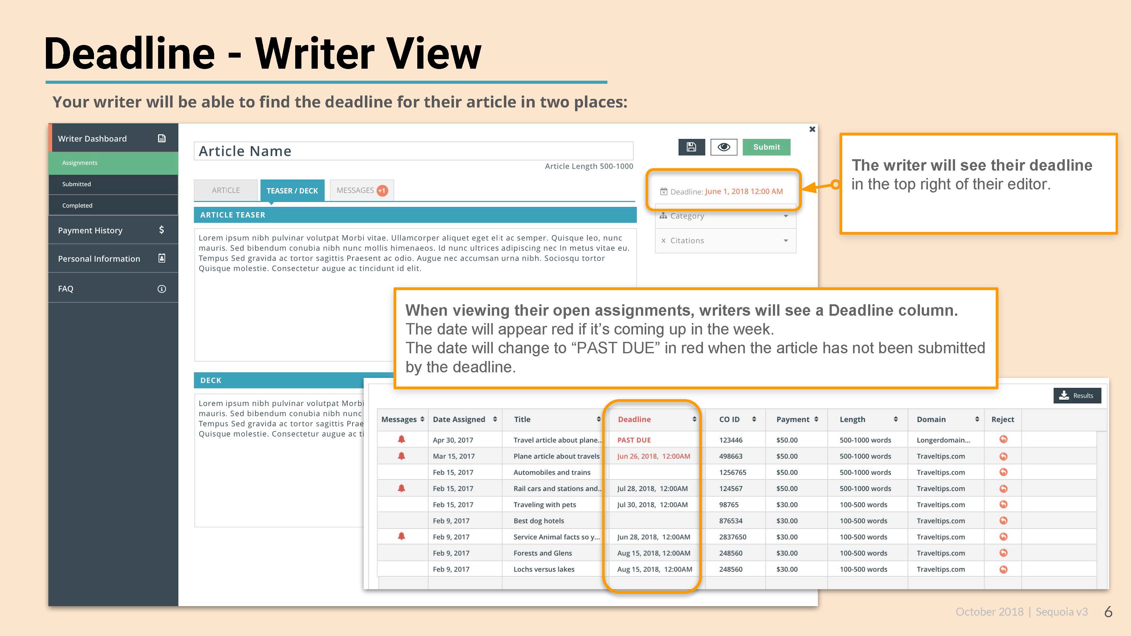
From listening to employees, I have been able to implement several new features and restructured many of the redesigns in order to improve the overall usability of Sequoia. New features include a messaging system and a deadline date editor in all content orders. Updates to the existing redesigns included visual UI improvement, improving the hierarchy of content order sections, and much more!
Another wonderful result has been hearing the developers and project managers discuss ‘usability’ and the needs of users! When I began work on the project and asked to interview employees using the CMS, I was met with confused looks and many questions as to why I’d need to. Research had not been conducted previously and users were often sent several page PDF ‘workarounds’ in response to support requests. Now the team frequently asks what the best language to use might be or what the most user-friendly way to design something might be!
