eharmony’s paywall had not been redesigned in a very long time. This project encompassed updating and improving eharmony’s paywall on both the desktop and mobile web site.
My Role
Senior Product Designer
Tools
Pen & Paper, Sketch, InVision, Zeplin
Mobile Web Paywall- Invision Prototype
Problem
The existing paywall did not reflect eharmony’s rebranded image, nor was it converting to the degree that Parship desired.
Solution
I updated the UI of the current Paywall designs to match our stakeholder’s vision as well as our new brand designs while adhering to legal requirements and best UX practices.
Project Goals
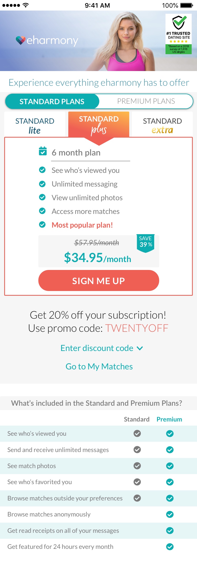
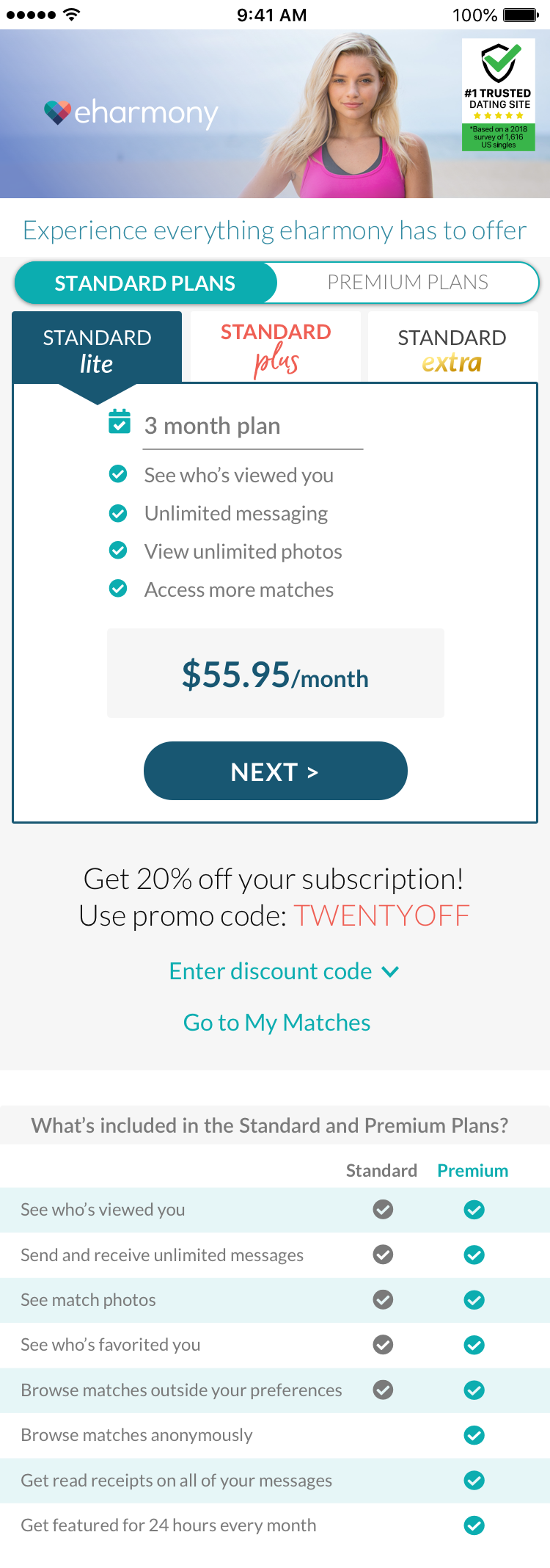
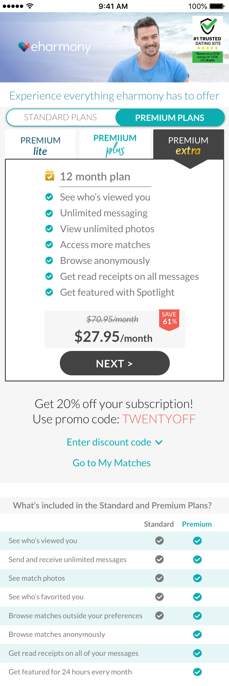
• Increase subscriptions to Standard plans, namely the 6-month plan
• Decrease subscriptions to the existing Premium plans
• Improve overall look of the Paywall and make all designs consistent with marketing rebrand
Process
Research
• Content evaluation of existing paywall designs
• Discussions with stakeholder, project manager, developers, and legal counsel regarding requirements, obstacles, and expectations
• Research of behavioral economics, best paywall practices and existing patterns
Design
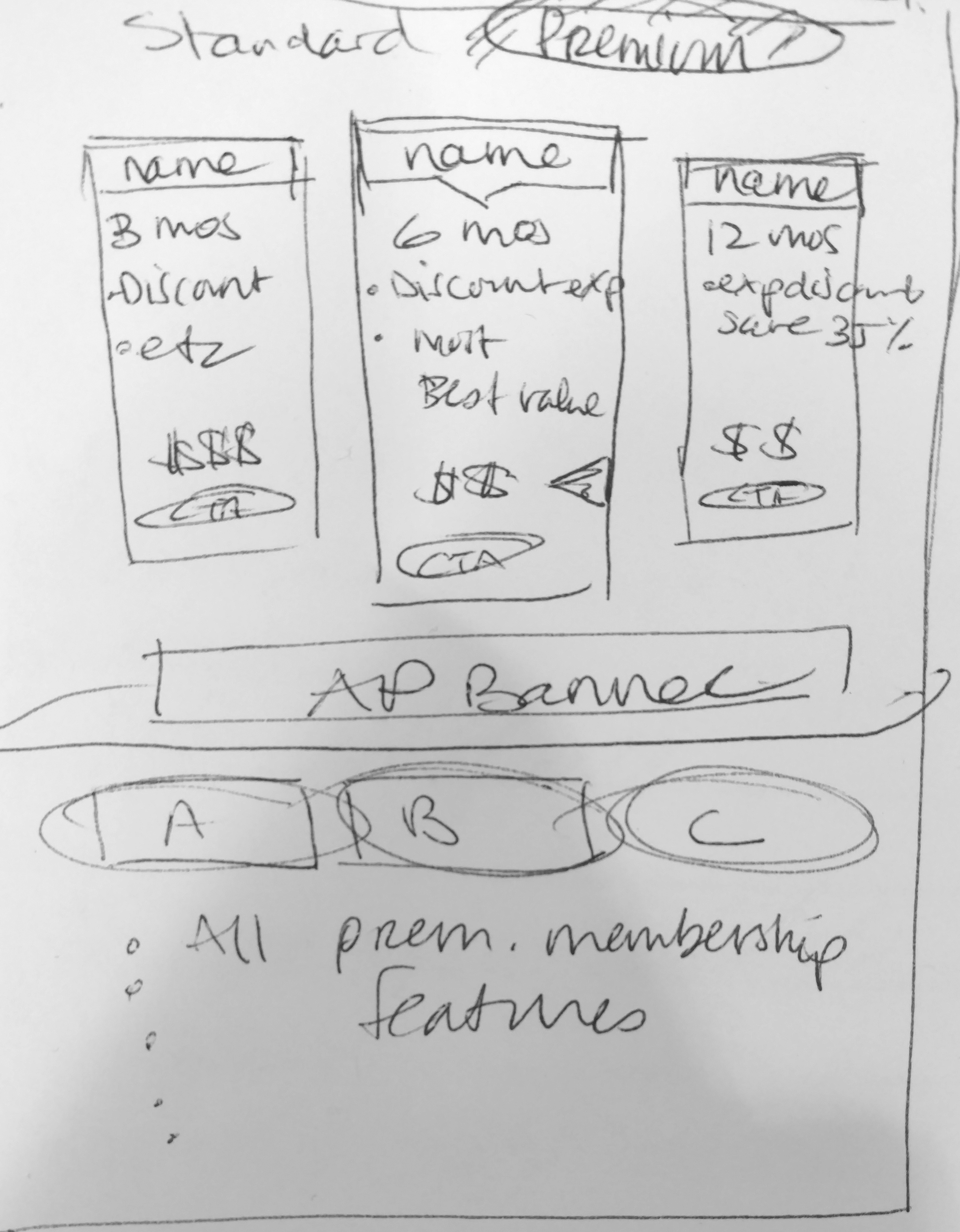
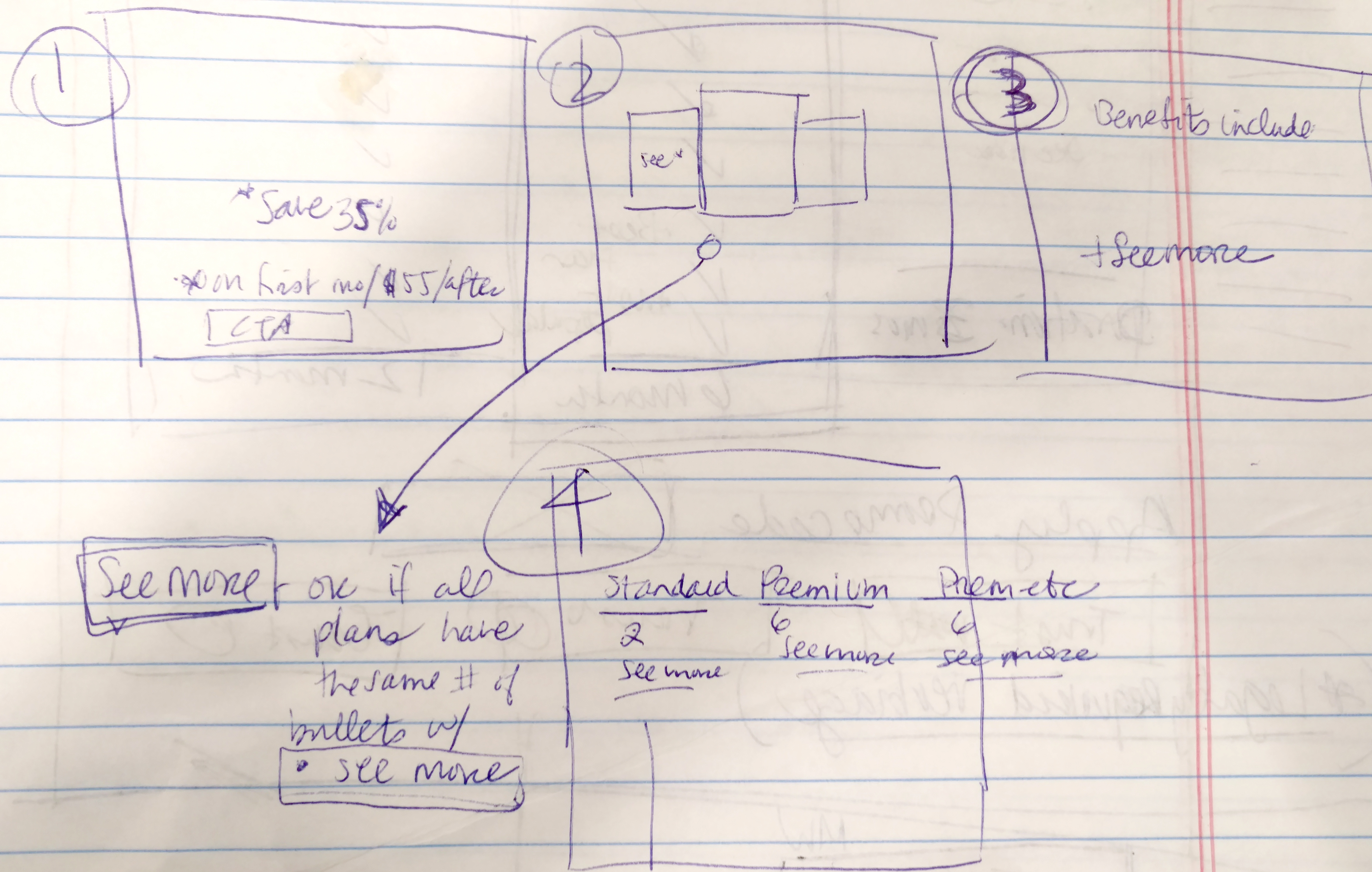
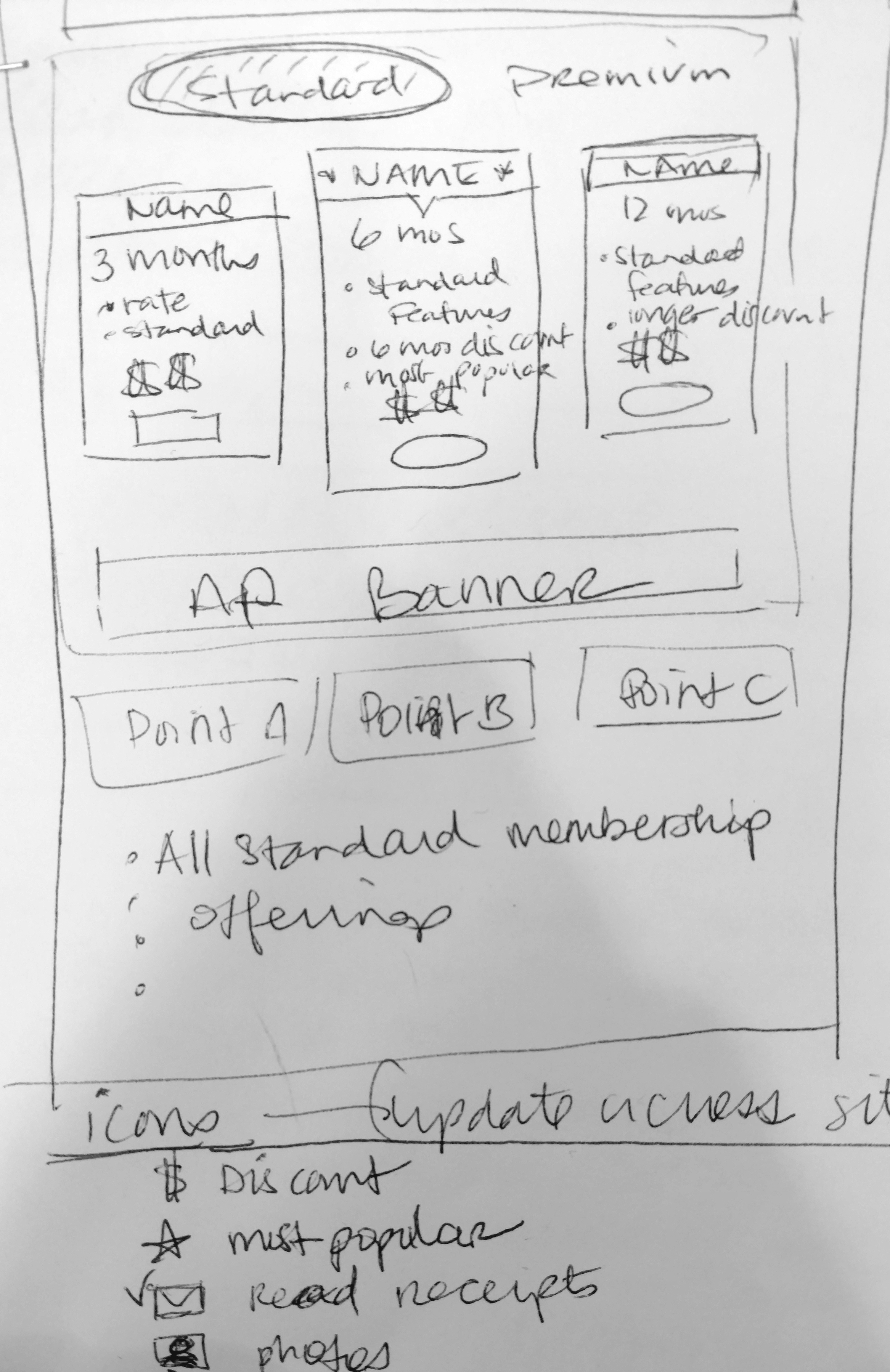
• Wireframes on paper and in Sketch
• Created visual elements consistent with new marketing designs
• Low Fidelity Mock-ups in Sketch and prototyped in Invision
• High Fidelity Designs in Sketch and exported to Zeplin to hand off to devs with comments and Invision prototypes for reference
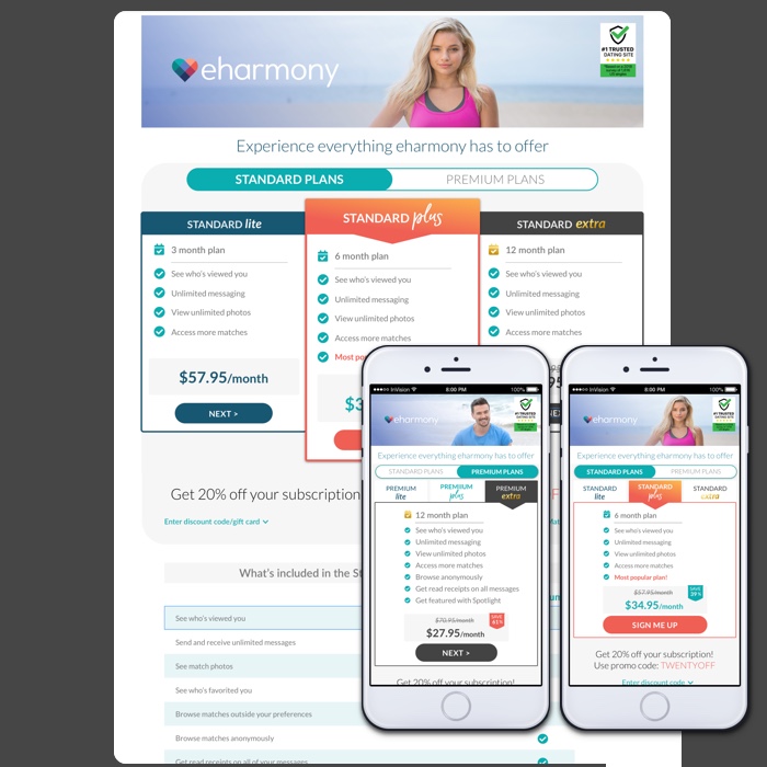
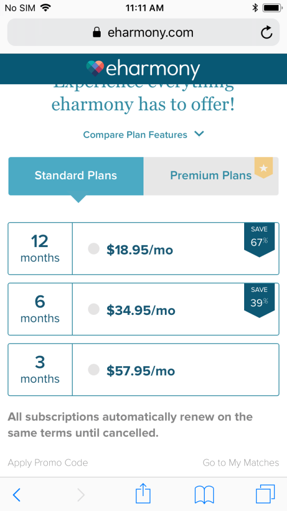
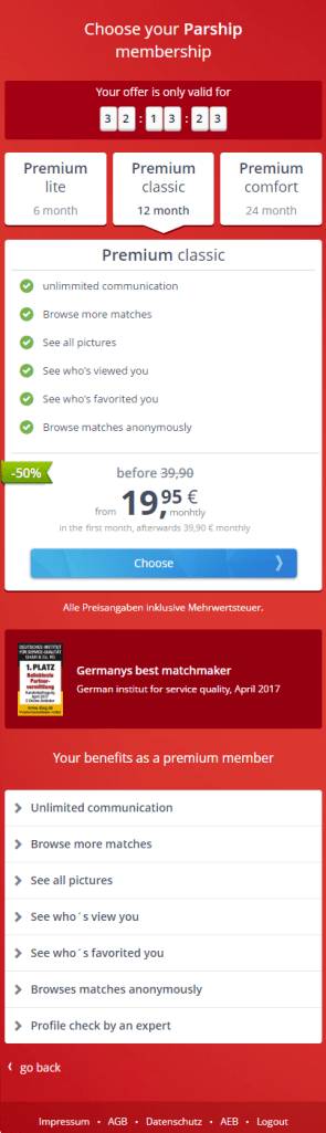
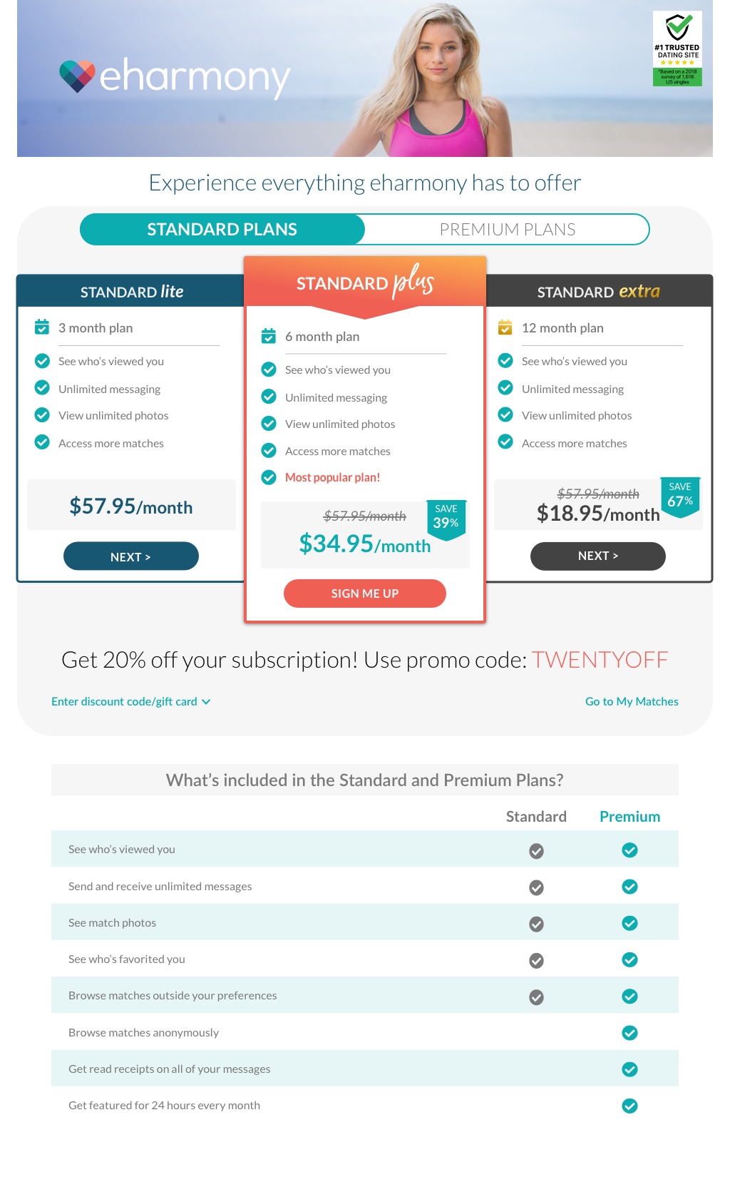
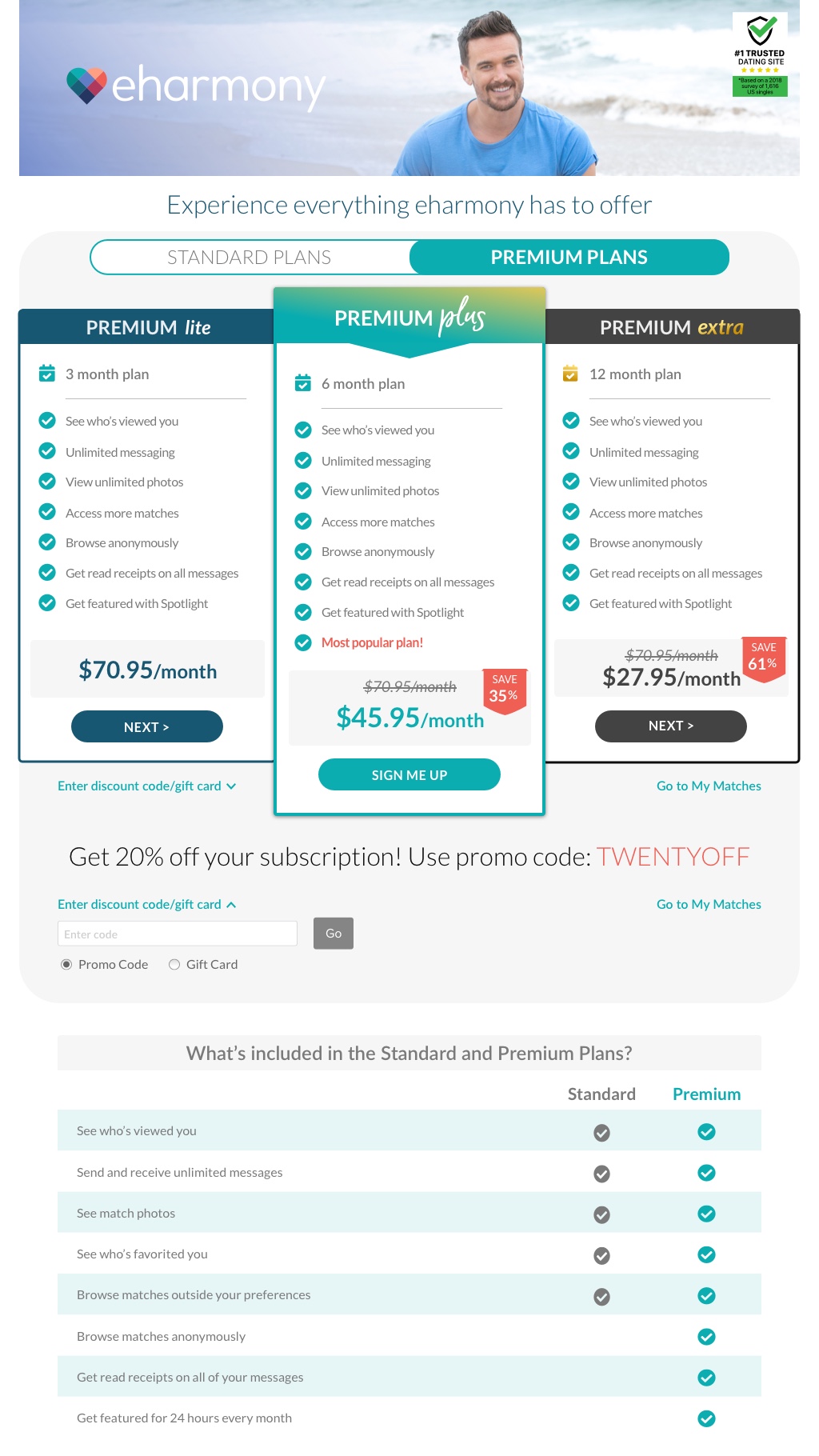
Mobile Web Before and After
Legacy Designs and Parship Paywall:
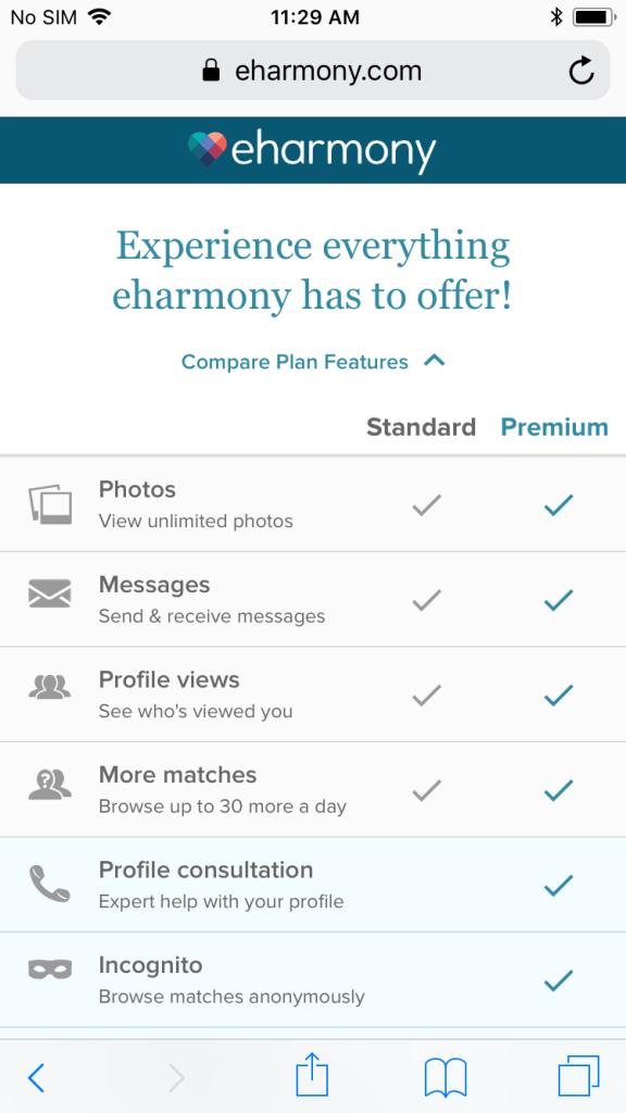
Final Designs:

Desktop
Legacy Design:

Sketches:
Final Designs:
Summary
Success! The new designs now match eharmony’s new branding and the 6-month Standard plan’s subscription rate increased far more than any other subscription plan and so far there has been a higher overall subscription to Standard plans over Premium.
